Claude Garamond's Typeface

n the 1540s, Claude Garamond designed his Roman typeface, inspired by Francesco Griffo’s 1495 Roman type cut for the Venetian printer Aldus Manutius. Garamond enhanced the elegance in the type, making it become so popular to this day.
The image to the left shows the excerpt of a book print by Estienne in Garamond. There are many small characteristic that makes this font different from other fonts:
- Medium contrast between thick and thin lines, making it easier to read while maintaining the essence of its influence from handwriting.
- Low x-height and long ascenders.
- Rounded serif brings a feeling of softness and gracefulness.
- Small counters in “a” and “e”.
- The letter “R” has a long, extended, elegant leg.
- “f” and “t” have very short crossbars, sometimes you can barely see them in small text.
- The “f” has a long, extended terminal that overshadows the letter next to it.

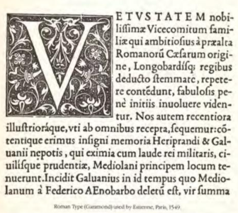
- The bottom stroke of the “E” extends the furthest, making the letter more stable. The top stroke of the “E” extends more than the middle one, creating balance.
- The “N” appears wider, adding weight and stability
- Both “a” and “g” are double-story.
- The “o” is slightly oval, a little wider than it is tall.
